Creating a Histogram in Excel
Creating a histogram is an essential part of doing a statistical analysis because it provides a visual representation of data.
In Part 3 of this Monte Carlo Simulation example, we iteratively ran a stochastic sales forecast model to end up with 5000 possible values (observations) for our single response variable, profit. If you have not already, download the Sales Forecast Example Spreadsheet.
The last step is to analyze the results to figure out how much the profit might be expected to vary based on our uncertainty in the values used as inputs for our model. We will start off by creating a histogram in Excel. The image below shows the end result. Keep reading below to learn how to make the histogram.
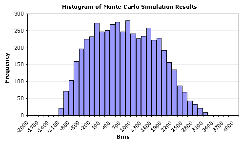
Figure 1: A Histogram in Excel for the response variable Profit, created using a Bar Chart.
(From a Monte Carlo simulation using n = 5000 points and 40 bins).
We can glean a lot of information from this histogram:
- It looks like profit will be positive, most of the time.
- The uncertainty is quite large, varying between -1000 to 3400.
- The distribution does not look like a perfect Normal distribution.
- There doesn't appear to be outliers, truncation, multiple modes, etc.
The histogram tells a good story, but in many cases, we want to estimate the probability of being below or above some value, or between a set of specification limits. To skip ahead to the next step in our analysis, move on to Summary Statistics, or continue reading below to learn how to create the histogram in Excel.
[ Generating Random Numbers ] ![]()
![]() [ Summary Statistics ]
[ Summary Statistics ]
Creating a Histogram in Excel
Update 7/2/15: A Histogram chart is one of the new built-in chart types in Excel 2016, finally! (Read about it).
Method 1: Using the Histogram Tool in the Analysis Tool-Pak.
This is probably the easiest method, but you have to re-run the tool each to you do a new simulation. AND, you still need to create an array of bins (which will be discussed below).
Method 2: Using the FREQUENCY function in Excel.
This is the method used in the spreadsheet for the sales forecast example. One of the reasons I like this method is that you can make the histogram dynamic, meaning that every time you re-run the MC simulation, the chart will automatically update. This is how you do it:
Step 1: Create an array of binsThe figure below shows how to easily create a dynamic array of bins. This is a basic technique for creating an array of N evenly spaced numbers.
To create the dynamic array, enter the following formulas:
B6 = $B$2
B7 = B6+($B$3-$B$2)/5
Then, copy cell B7 down to B11
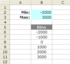
Figure 2: A dynamic array of 5 bins.
After you create the array of bins, you can go ahead and use the Histogram tool, or you can proceed with the next step.
Step 2: Use Excel's FREQUENCY formula
The next figure is a screen shot from the example Monte Carlo simulation. I'm not going to explain the FREQUENCY function in detail since you can look it up in the Excel's help file. But, one thing to remember is that it is an array function, and after you enter the formula, you will need to press Ctrl+Shift+Enter. Note that the simulation results (Profit) are in column G and there are 5000 data points ( Points: J5=COUNT(G:G) ).
The Formula for the Count column:
FREQUENCY(data_array,bins_array)
a) Select cells J8:J48
b) Enter the array formula: =FREQUENCY(G:G,I8:I48)
c) Press Ctrl+Shift+Enter
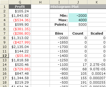
Figure 3: Layout in Excel for Creating a Dynamic Scaled Histogram.
Creating a Scaled Histogram
If you want to compare your histogram with a probability distribution, you will need to scale the histogram
so that the area under the curve is equal to 1 (one of the properties of probability distributions).
Histograms normally include the count of the data points that fall into each bin on the y-axis, but
after scaling, the y-axis will be the frequency (a not-so-easy-to-interpret number that in all practicality
you can just not worry about). The frequency doesn't represent probability!
To scale the histogram, use the following method:
Scaled = (Count/Points) / (BinSize)
a) K8 = (J8/$J$5)/($I$9-$I$8)
b) Copy cell K8 down to K48
c) Press F9 to force a recalculation (may take a while)
Step 3: Create the Histogram Chart
Bar Chart, Line Chart, or Area Chart:
To create the histogram, just create a bar chart using the Bins column for the Labels and the Count or Scaled column as the Values. Tip: To reduce the spacing between the bars, right-click on the bars and select "Format Data Series...". Then go to the Options tab and reduce the Gap. Figure 1 above was created this way.
A More Flexible Histogram Chart
One of the problems with using bar charts and area charts is that the numbers on the x-axis are just labels. This can make it very difficult to overlay data that uses a different number of points or to show the proper scale when bins are not all the same size. However, you CAN use a scatter plot to create a histogram. After creating a line using the Bins column for the X Values and Count or Scaled column for the Y Values, add Y Error Bars to the line that extend down to the x-axis (by setting the Percentage to 100%). You can right-click on these error bars to change the line widths, color, etc.
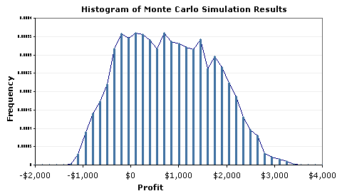
Figure 4: Example Histogram Created Using a Scatter Plot and Error Bars.
[ Generating Random Numbers ] ![]()
![]() [ Summary Statistics ]
[ Summary Statistics ]
