Waterfall Chart Template
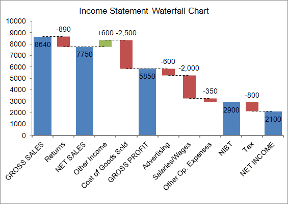
A Waterfall Chart or Bridge Chart can be a great way to visualize adjustments made to an initial value, such as the breakdown of expenses in an income statement leading to a final net income value. The initial and final values are shown as columns with the individual negative and positive adjustments depicted as floating steps. The connecting lines between the columns make the chart look like a bridge with two or more pillars. When analyzing net profit for a product starting from a sale price, where all the adjustments are negative, the chart often resembles a waterfall.
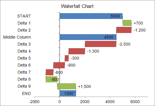
Sample bridge chart created using the Waterfall Chart Template
If you search on Google, you can find many tutorials and articles that explain how to construct a waterfall chart in Excel using stacked columns or bars. Some tutorials also explain ways to create the connecting lines [1], or how to handle negative values [2].
Update 7/2/15: A Waterfall chart is one of the new built-in chart types in Excel 2016! (Read about it).
For the sake of being different, the waterfall chart template I created uses error bars instead of (or in addition to) stacked columns or bars. Error bars are used to create the connecting lines and the stepped values, and they simplify handling negative values (though perhaps not as simple as the technique of using up-down bars explained by Jon Peltier). Invisible stacked columns are used for positioning and displaying the data labels. But, you do not need to know how to create the chart from scratch in order to use the template.
Waterfall Chart Template
for Excel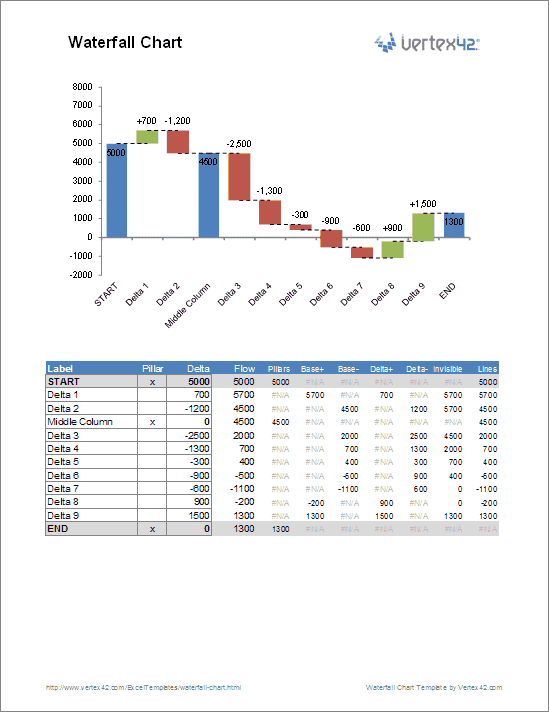
File: waterfall-chart.xlsx
Template Details
License: Private Use(not for distribution or resale)
"No installation, no macros - just a simple spreadsheet" - by Jon Wittwer
Description
This template contains two separate worksheets for creating either a horizontal or vertical waterfall chart. After creating your chart, you can simply copy and paste it into a presentation or report as a picture.
Summary of Features
- Allows negative values
- Includes dashed horizontal connecting lines
- Includes data labels formatted to show + and - adjustments
- Define intermediate values by placing an "x" in the Pillars column.
- Add new values by inserting rows and copying formulas down
- No macros
Using the Chart in Another Workbook
If you want to use this chart in an income statement or some other workbook that you are using for your own private use, you can copy the entire waterfall worksheet into your other workbook and use cell references to link values in the data table to values in your statement.
Using the Waterfall Chart Template
Easy Stuff
All you need to do is edit the Labels, the Delta values, and place an "x" in the Pillars column if you want to display an intermediate value.
Inserting/Deleting Rows
To insert new rows, just right-click on a row number and select Insert Row. Then immediately press Ctrl+D to copy all the formulas from the previous row.
The first and last rows use unique formulas, so you should not delete those rows, and when you insert a row, insert new rows somewhere between the 2nd row and above the last.
Editing Column Widths
The pillars are created using a Column Chart series (or a Bar Chart series in the vertical chart). So, you can edit the width by adjusting the gap percentage (Format Data Series > Series Options).
The positive and negative adjustments are error bars. You change change the width by editing the line width for the Base+ and Base- error bars (Format Error Bars > Line Color and Line Style > Width).
Editing Label Positions
The data labels are displayed using invisible stacked columns. If the data labels don't end up where you want them, you can manually change the location of each individual data label by dragging them with your mouse.
Formatting Data Labels
The data labels for the negative adjustments use a custom number format of "-#,##0;-#,##0" to force the values to show the negative sign "-" even though the actual values in the data table are positive (in the Delta- column). Why? To get the data labels positioned conveniently, the values for the stacked columns are positive, so we force the labels to include a negative sign.
Selecting Error Bars and Data Labels
The image below shows the easy way to select individual chart series and error bars. Select the chart, then go to the Layout tab under the contextual Chart Tools menu. Select the chart element from the drop-down box and then click on the Format Selection button.
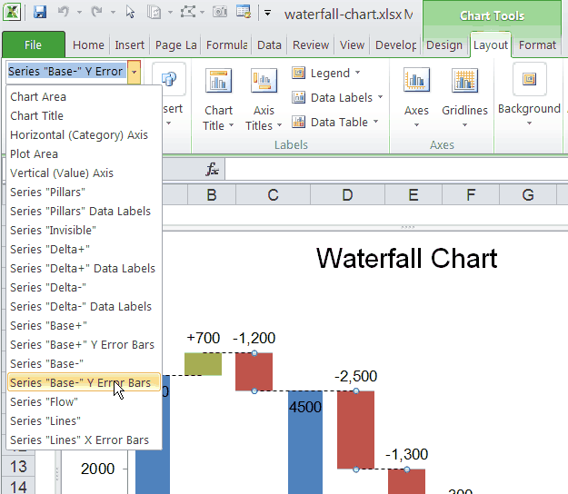
This screenshot shows the drop-down box for selecting different chart elements via the Chart Tools ribbon.
References and Resources
- [1] Waterfall Charts Using Excel at Chandoo.org
- [2] Excel Waterfall Charts (Bridge Charts) at PeltierTech.com
- Waterfall Chart at wikipedia.com
- Create an Excel Waterfall Chart at Contextures.com
